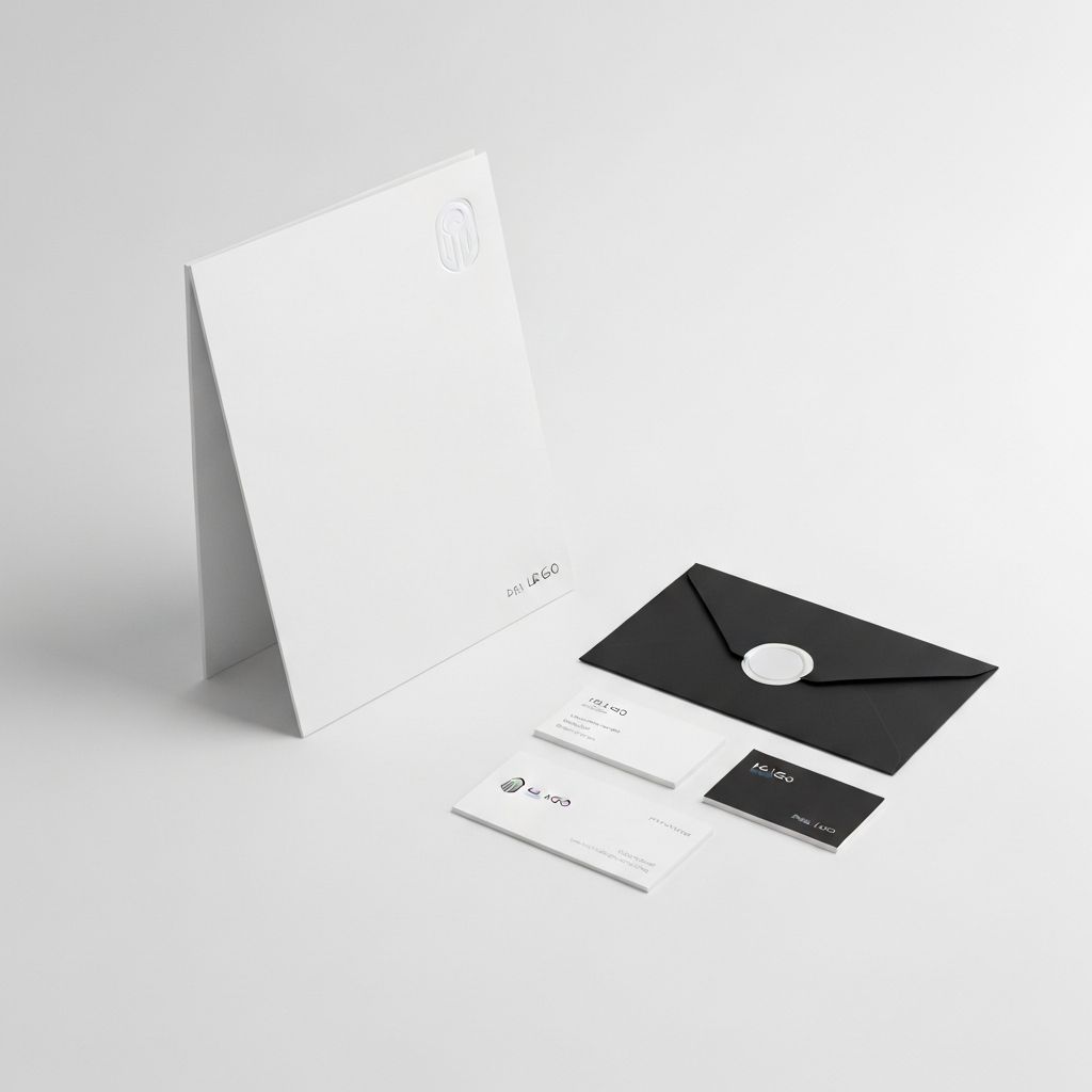
A minimalist brand identity for a cutting-edge cloud infrastructure provider.
The Challenge
What We Solved
Vortex Systems needed to stand out in a crowded market of cloud providers. They wanted a brand that communicated stability, speed, and simplicity without relying on tired clichés.
The Solution
How We Did It
We created a brand identity centered around the concept of controlled energy. The logo is a stylized vortex representing power and precision. The color palette uses deep blues and stark whites to convey trust and clarity, with Swiss-inspired typography reflecting the company's engineering heritage.


Project Details
Client
Vortex Systems
Service
Brand Identity
Date
September 2023
+35%
Brand Recognition
+50%
Lead Gen
+12%
Market Share
Next Project
Pulse Health
View Project